|
Joel Meyerowitz: Cezanne's Objects
Hardback
Main Details
| Title |
Joel Meyerowitz: Cezanne's Objects
|
| Authors and Contributors |
By (author) Joel Meyerowitz
|
| Physical Properties |
| Format:Hardback | | Pages:112 | | Dimensions(mm): Height 320,Width 255 |
|
| Category/Genre | Individual photographers |
|---|
| ISBN/Barcode |
9788862085649
|
| Audience | |
|---|
| Illustrations |
Illustrated in colour throughout
|
|
Publishing Details |
| Publisher |
Damiani
|
| Imprint |
Damiani
|
| Publication Date |
5 October 2017 |
| Publication Country |
Italy
|
Description
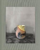
Cezanne painted his studio walls a dark grey. He mixed the color and painted it himself. Every object in the studio, which was illuminated by a vast north window, seemed to be absorbed into the grey of the background. There were no telltale reflections around the edges of the objects. So there was nothing that could separate them from the background itself. And Meyerowitz suddenly saw how Cezanne, making his small, patch-like brush marks, moved from the object to the background, and back again to the objects, without the familiar intervention of a renaissance- like illusion of perspective. After all, Cezanne's was the first voice of 'flatness,' the first statement of the modern idea that a painting was simply paint on a flat canvas, nothing more. And here was an environment that he had made to serve his idea, in which the play of light on this particular tone of grey - which was not like the darkness of Dutch interiors - but was a more precisely keyed background hum that allowed an exchange between say, the red of an apple and the equal value of the grey background. It was a proposal of tonal nearness that welcomed the idea of flatness. Meyerowitz tooke each of Cezanne's objects in hand and look at them against the grey wall, and the photographer managed to convince the Director of the Atelier to let him do this - no one had touched these objects in ages - and for some reason she agreed to let him do as he wished. His impulse was to place each one in the exact same spot on his marble topped table and just make a 'dumb' record of it. Meyerowitz had the impulse to see them in rows, almost as if they were back on his shelf above the table, so he decided to make a grid of 5 rows with 5 objects on each row - with Cezanne's hat as the centerpiece - and see what they felt like when seen together at approximately life size. He was immediatly drawn to them at this scale.
ReviewsHere, simplicity reigns.--Cole Teju "The New York Times" Training a lens on Cezanne's bottles, pitchers, and bowls is a fitting homage...--Andrea K. Scott "The New Yorker"
|